YES Cake

Pop Architecture cake construction in support of the Voice!
In support of the ‘yes’ vote, we took our YES Cake to the Melbourne Royal Show and won the Live Judging Decorated Cake competition!

What even is inclusive design?

NGV Architecture Commission Design Competition

Collaboration between The Flaming Collective & Pop Architecture.

The NGV Architecture Design Competition invites architects and multidisciplinary teams to propose a project that explores new terrain for an architecture commission – from a conceptual, material, experiential or formal sense. Submission requirements are a text narrative and two images.

The NGV encourages entries that are ‘thought-provoking, issues-led, relevant and resonant and that can, in a non-didactic way, facilitate or instigate conversations, dialogue, immersion, or reflection.’

The Flaming Collective

The Flaming Collective is a CAMP bunch of queers researching and demonstrating the benefit of the queer lens in our built environment. The Naarm and Boorloo team have been working to spread their Gay* agenda throughout the industry, including at the upcoming 2023 AIA Australian Architecture Conference in Canberra (so fancy). The Flaming Collective is comprised of Graduate Architects Grace Webster, Dexter Wong, Matthew McGivern, and Sebastian Robinson, with hopes to adopt more queers and allies in the future.

*Because “two gay men, a gaysian, and a theoretical pansexual but practising lesbian” agenda does not have the same ring to it!

Pop Architecture

Pop Architecture is an award-winning Naarm-based design practice established in 2016 by Katherine Sainsbery and Justine Brennan. Their enthusiastic team of eight includes Dexter Wong. Pop is well practiced at turning abstract concepts into compelling built form with inherent social and environmentally sustainable outcomes. Collaborating with Landscape Architect Sarah Perry also ensures highly emotive, sensory and integrated landscape responses.

The Flaming Collective & Pop Architecture see the NGV Architectural Commission as a unique opportunity to test queer design methodologies with a tangible and unapologetic design response.

Design Statement

What is the idea and how is it translated through the design?

This scheme interrogates the notion of inclusivity through adopting a queer architectural lens in the design of a public space. Queer methodology is born out of the inherent understanding by queer people of how it feels to be excluded. Pop’s mapping of the wider city, which involves the analysis of perceived points of safety/unsafety and comfort/discomfort, becomes the key architectural driver for the scheme. From here, a camp approach to design imbues a fluorescent yellow paracord structure, exaggerating these spatial recordings. The paracord sprays through the space, drenching the garden, intentionally framing, concealing, revealing, segregating and filtering.

Why is the idea important right now and how is it relevant to a wider audience?

Everyone deserves the right to feel safe, yet our world remains ripe with volatility. Although gender violence and violence against queer and gender-diverse people has increased worldwide, safety and comfort in design must be afforded to all. So, how can Architecture and Landscape facilitate this? From a queer perspective, we acknowledge “universality” fundamentally excludes those who don’t conform and the provision of diverse architectural experiences of safety and comfort is the key to designing inclusively for all those who inhabit space.

Describe the audience experience

Stepping off the bridge, you’re faced with a fluorescent yellow paracord barrier, the density of which filters your perspective to the familiar sculptures within the Grolle Equiset garden. Follow the barrier-come-warm-ribbon as it splashes, pools and sprays, offering an opportunity to peek through and earn your first glimpse of the artefacts. The contortive ribbon caresses the landscape, expanding and contracting, creating outdoor “rooms” of varying levels of safety and comfort. As your curiosity leads you through the gardens, tracing the origin of the seemingly endless fluorescent trail, you discover a little surprise at the end of the stream.

Wallpaper* Architects Directory 2023

Pop Architecture, Australia

Pop Architecture has been selected by Wallpaper* Magazine as one of 20 architecture studios worldwide to join their emerging practice watchlist.

Article (written by Ellie Stathaki)

The full list for the Wallpaper* Architects Directory 2023 has been revealed, celebrating 20 studios as our finest emerging architects to watch. 

Conceived in 2000 as an international index of architectural talent, the Wallpaper* Architects’ Directory is our annual listing of promising practices from across the globe. While always championing the best and most promising young studios, over the years, the project has showcased inspiring work with an emphasis on the residential realm. Now including more than 500 alumni, the Architects’ Directory is back for its 23rd edition. 

Join us as we launch this year’s survey – 20 young studios, from Australia, Brazil, Canada, Congo, Ecuador, Greece, Hong Kong, India, Italy, Japan, Lebanon, Mozambique, Pakistan, Senegal, Spain, Sweden, Switzerland, the UAE, the UK, the USA and Vietnam, with plenty of promise, ideas and exciting architecture.

Pop Architecture, Australia

'The Pop Art movement, dry humour and architecture' brought practice partners Katherine Sainsbery and Justine Brennan together, when they set up Pop Architecture over six years ago. Their portfolio brings together a site-specific approach with their own take on materiality and formal expression. For them, 'excellence in architectural practice supports the vision of the studio and consists of using a tried, tested and flexible design process to achieve successful outcomes; happy clients and collaborators; and continuous improvement'. 

The female-led practice promotes 'balance in the workplace, discouraging overtime and modelling sharing of responsibility'. It encourages staff development through collaboration and communication. At the same time, the word 'Pop' captures key tenets of its ethos, the founders explain. 'The process used to generate artwork by artists such as Andy Warhol and Roy Lichtenstein resonates with [us]. The notion of removing the artist's hand and producing work via a production line draws parallels with contemporary architectural practice – both in terms of the number of people involved in completing a project, and in the creative opportunities which lie in the process of trying to simplify or optimise a design.'


Link to full article on Wallpaper*
Featured in the October 2023 issue of Wallpaper* Magazine

Australian Design Review: Pop Architecture

Featured Emerging Practice

Pop Architecture were recently featured in the Architectural Review Issue No.169 and on Australian Design Review as the featured emerging practice.

Article (written by Isla Sutherland for Australian Design Review)

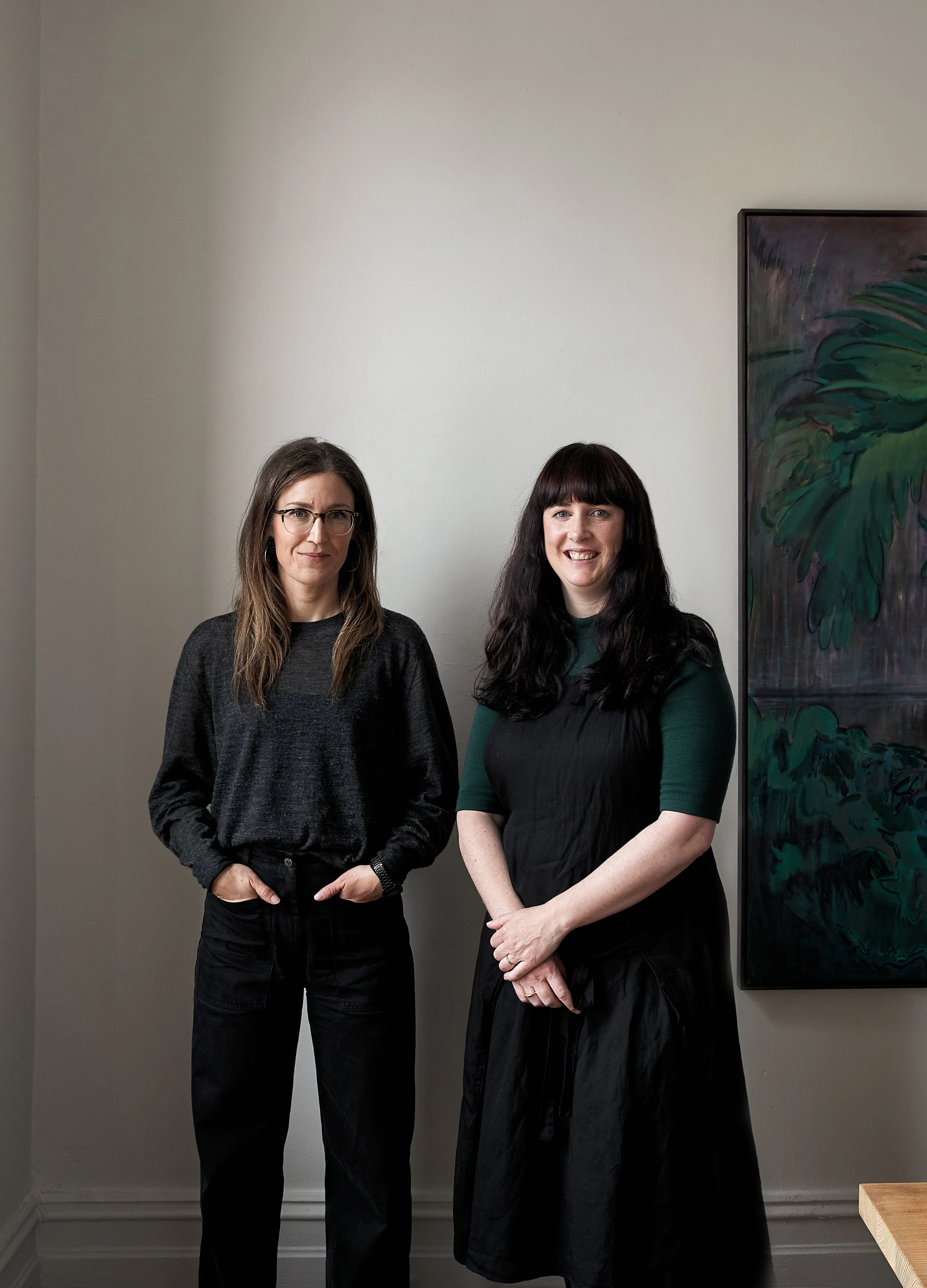
As one of the country’s few female-led practices, Pop Architecture in Melbourne isn’t fixed on gender, but on the absence of ego.

“We were both in quite different places when we decided to start; it wasn’t particularly conscious or planned,” says co-founder and director Katherine Sainsbery. “I’d left Wood Marsh earlier that year and had a young child. Justine had taken a six-month industry sabbatical after leaving Architectus, and we connected late in 2016.” Sainsbery’s father, David Sainsbery, retired chief executive officer at Architectus, suggested she meet up with Justine Brennan, as a potential partner in business.
“We call it an arranged marriage,” Sainsbery laughs. The pair soon found they shared an affinity for each other’s rigorous process, design sense and dry wit. In December this year, the practice celebrated its fifth anniversary, with Pop formalised over Christmas drinks in 2016.

The practice acquired its initial work through interior designers. “I had strong professional relationships with a couple of different people: Karyne Murphy, who we worked with on the Fallow house, and Beatrix Rowe who we worked with on South Yarra,” says Sainsbery.
“We were really fortunate that both of those women, essentially sight unseen, recommended us and got behind us. They were both keen to support an emerging female-led practice,” says Sainsbery. This reciprocity has come to inform their working style.
“Because we received a lot of our early projects through two interior designers, straightaway we learned how to collaborate,” says Brennan.
“We both really enjoyed that from our previous jobs – the collaboration with consultants, builders and clients. It’s often one of the most beneficial parts of the project, and hence why Kat was referred by builders and interior designers from other projects.”

The duo says that their understanding of their role in the greater construction process, paired with their respect for others’ expertise, has helped forge lasting working relationships in the sector.
“As architects, we tend to design from the outside in, whereas the interior design approach can be different – designing from the inside out. It’s really forced us to think about it from that perspective as well,” says Sainsbery. “It’s a real push/pull of what’s more important.”
She adds that in finding themselves in the residential sector in particular, the practice has had to at times reprioritise this hierarchy. “Clients don’t always have an opinion on architecture or don’t feel particularly educated in that area to comment on it, but interiors are different. You’re so saturated by them that clients have strong opinions on the subject.”

The pair found their style and process were informed by a curiosity for the intersection of art and architecture. “The word ‘pop’ is not incidental or frivolous: we both like and appreciate pop art and, as common as that may seem, it’s more specific than that,” Sainsbery explains.
“We like the art, but we’re more interested in the process behind it. How pop art was produced in many cases, was that the artist had a concept and a production line generated it. That production line gave rise to many innovations and efficiencies to create something interesting and creative, but that had a stringent, rigorous process behind it.”

Sainsbery refers to the works of 1960s artists Andy Warhol and Roy Lichtenstein. She and Brennan are interested in the way their art removes the artist’s hand, producing works via production line, which draws many parallels with contemporary architectural practice. “That’s something common to the way we both work: we both like process, we like something to be rational, but that doesn’t mean it has to look like a boring mass-produced box,” Sainsbery says.
“It’s also about understanding your place in the production line of construction,” she adds.
“As an architect, your medium is communication – you’re writing instructions for how to build a building. The thing that you produce isn’t the actual finished product. ‘Pop’ is about the ability to understand that and lean on people with more expertise to make projects better.”

The pair decided the reason they wouldn’t call their practice ‘Sainsbery Brennan’ – “apart from being a total snooze of a name,” Sainsbery jokes – is because they wanted a name that would encourage ownership from other people, both across a project and over the life of the practice.
The women are self-effacing when asked if they considered themselves anomalies as two female directors in a male-dominated sector. Brennan and Sainsbery have pushed along their practice of five while both have taken a stint of maternity leave, continuing to deliver an exceptional body of work while raising young families. Brennan theorises that the pair was perhaps better prepared for the unconventional work conditions enforced on the sector during COVID because they were already used to working under ‘flexible’ constraints.

Reflecting on their female-led practice, Brennan says, “Sure, it is a differentiator, but what clients say to us is they’re looking for people who will listen to them and to what they want, without an ego in the way. It’s something that’s been so reoccurring to the point where we’re like, ‘Is that really what the common experience of working with an architect is?’”
“Because we’re a relatively new practice, we don’t have this body of work behind us for people to see and say: that’s Pop. So we’ve really had to design each building for the site and for the client. There is obviously consistency in the things that we like in terms of design, but they’re also unique to the client and the client’s brief,” she says.
“I think we are looking forward to a time when we can be approached more for our unique architectural sensibility. But, in the meantime, it’s nice to be approached because people have heard you’re good to work with,” says Sainsbery.

While their humility is one of their great attractors, it can also pose its own challenges. “Running your own practice is very different to working in another firm – even in design-focused firms like we’ve been in – there, you put on the hat of whoever it is you’re working for,” says Sainsbery.
“But when we had the blank piece of paper in front of us, we were forced to interrogate our own design approach and philosophy.
“We’ve done a lot of that, and it’s been good and challenging. We’re very critical of ourselves and our work.”

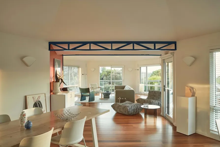
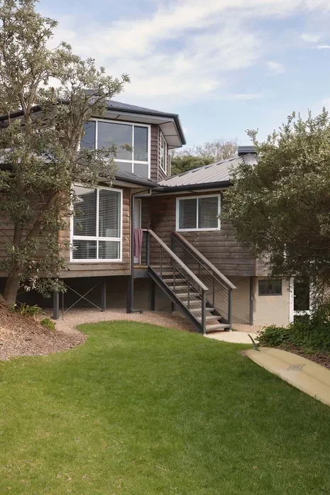
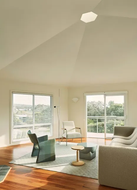
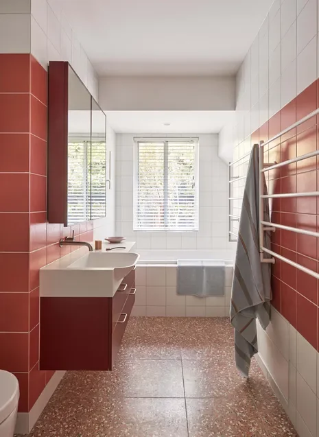
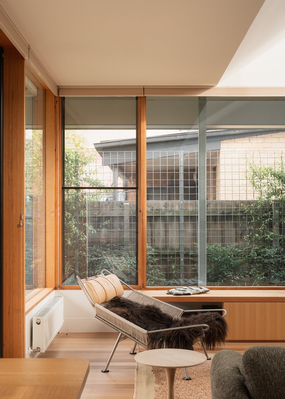
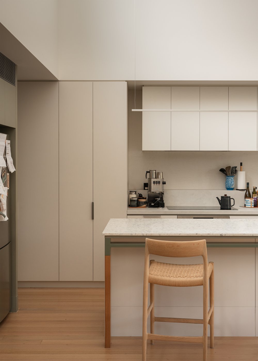
This evaluative rigour really shows. Sainsbery and Brennan have created a practice that is sensitive to the surrounding environment and attuned to a client’s needs. Motivated by great design outcomes, their process generates considered and original forms, with an intimate understanding of space and materiality.

Link to full article on Australian Design Review

Australian Design Review: South Yarra House


“Pop Architecture injects ‘contemporary lightness’ into Melbourne renovation”

Pop Architecture’s South Yarra House was recently featured in the Architectural Review Issue No.169 and on Australian Design Review.

Article (written by Isla Sutherland for Australian Design Review)

Pop Architecture’s brief for South Yarra house specified a reverence for the period features, but also a revitalisation to the space in terms of its engagement with light and texture.

In other words, the preservation of the original character with an injection of contemporary lightness and ease.

Pop Architecture was engaged alongside Beatrix Rowe Interior Design on this bespoke extension in South Yarra from concept design to contract documentation.

The clients had carefully considered their brief and one of the key criteria was to be efficient in what they were requesting in terms of space. As a result, the brief scantily stated that they wanted curves and real materials. Outside of that, Pop Architecture was presented with a carte blanche to work with the space how the practice saw fit. “We always go to site together and take it in,” explains co-director Katherine Sainsbery of their process.
“We try to avoid oversaturation of a thousand reference images from other architects or projects, and we will try to come up with what we refer to as the abstract concept for project.
“It can be as simple as ‘solid versus fine’, that you then use as an overarching concept to apply to details and the main form.”

A weathered piece of corrugated fencing inspired the texture explored explicitly throughout the home.

From their first experience on-site, it was evident the pair extracted the same core themes that would eventually inform the design. “We had both taken photos of light on this weathered piece of corrugated fencing,” adds fellow Pop Architecture co-director Justine Brennan and, as banal as it may seem, that texture has been explored explicitly throughout the home, from the texture of the brickwork to the changing vertical motif of the terrace.

From the project’s conception, the design became centred on the penetration of light into the house.
“We’re always breaking up a form to see where we can get light in,” says Sainsbery. “And it’s amazing how varied the outcomes are.” The pair started with key incisions where they wanted to direct light in.
“Beyond that, it’s about how to explore what the light is doing in an interesting way. In this project, there were a couple of ways that we did that: one was to do with light on curved surfaces, and the other was light on textured materials. In both cases it was the ephemeral effects of each – the changing experience of those finishes over the course of the day,” says Sainsbery.
Incoming light glances off the curling apertures to create a natural and animate glow.
“It’s not as static or two-dimensional,” Sainsbery explains.
“When you have a rectilinear form, the light is either on one surface or another. Whereas, on a curve, it’s a bit more ambiguous.”

A restrained palette and terrazzo surfaces dominate the home’s interiors.

The rear extension faces due north. “You always hear that it’s best to face north, which is true in theory, but when you’re talking about an inner city Melbourne block, they’re long and slender,” says Sainsbery.
“Yes, it’s nice to have a north-facing backyard, but often it means the rest of the house is in complete darkness.”
“On South Yarra, we were trying to avoid that stereotypical experience of a renovated Heritage home, where you rush through the existing part and your whole experience of the project is trying to get to the end. We wanted the family to enjoy being in the house as soon as they stepped foot in it, rather than having to wait until the end,” adds Brennan.

There’s a large clerestory window at the end of the hallway, so as soon as someone steps foot in the house, they are greeted with a great flood of light and view of the tree beyond. The silver eucalypt breaks the horizon, fracturing the light to create a dappled experience on the interiors. The slender line of the trunk and carved bough of the branches engages with this polyphony of lines and curves. This repetition appears in the intricate layering technique of the brickwork on the outer extension.
“The bricklayer calls it the corduroy method, which gives this corrugated feel to the brickwork,” says Brennan. The play of light over the undulating surface perfectly mimics what captured the architects’ imagination about the weathered fence detail on their initial visit.

The vertical corbelling of the brickwork is repeated on the roof terrace.

The duo says that their understanding of their role in the greater construction process, paired with their respect for others’ expertise, has helped forge lasting working relationships in the sector.
“As architects, we tend to design from the outside in, whereas the interior design approach can be different – designing from the inside out. It’s really forced us to think about it from that perspective as well,” says Sainsbery. “It’s a real push/pull of what’s more important.”
She adds that in finding themselves in the residential sector in particular, the practice has had to at times reprioritise this hierarchy. “Clients don’t always have an opinion on architecture or don’t feel particularly educated in that area to comment on it, but interiors are different. You’re so saturated by them that clients have strong opinions on the subject.”

The vertical corbelling of the brickwork paired with the round, meandering corners gives the exterior a sculptural feel. This repetition can be seen again on the roof terrace. “One of the good things about being a single storey is that you can explode the roof form,” says Sainsbery.
The pair had to use an overlooking compliant screen, which they saw as another opportunity to explore the concept of light and curves.
“It’s sort of the inverse of the solid brick form: it’s a fine form with gradient in opacity and transparency from one side to another, which creates some really beautiful shadows on the terrace upstairs that shift across the course of the day,” says Sainsbery.

For the interiors, Pop Architecture collaborated with interior designer Beatrix Rowe. She too has engaged with this tension between bold and fine, played out in the restrained palette and striking terrazzo surfaces.
Rowe has combined linear track lighting with curvaceous stone surfaces that recreate that almost sculptural consolidation of hard lines and roundness. Contrasting elements like the brickwork and hard plaster are offset against the fine fenestration and timber fretwork.

The resulting home is a playful engagement with tensions, recontextualising a period house with a contemporary overlay. The completed work is both new and timeless, permeating with soft, diffuse light that undergoes an intriguing mercuriality throughout the day.


Link to full article on
Australian Design Review

Christmas out of the Bubble 2021

A relaxed industry networking event organised by Pop Architecture. It was great to celebrate the end of a tumultuous year and life post lockdown with the local architecture and design community.

One star does not a firmament make

Architectural Fairy Tales Competition

Collaboration between Pop Architecture & The Hotham Street Ladies.

The Fairy Tales competition invites creatives and designers to submit their own unique architectural fairy tale. Submission requirements are a text narrative and five images.

The brief is as simple and open as a ‘unique architectural fairy tale’, with supporting briefing material commenting that ‘the competition returns at a time when real news is often grim and scary, and ‘fake news’ sows discord and diffidence. In a time like this, storytelling might be the most powerful tool to unlock universal truths and rediscover what matters.’ And furthermore, that ‘these stories are as universal as the buildings we inhabit’ and ‘design is best when it tells a story. Your story.’

Narrative Synopsis

The story explores the social trend of starchitects and their buildings. These buildings are symbols of their egos and are often functionally deficient or not designed in a way which prioritises their inhabitants. They are an exercise in their particular brand of form making. The buildings are about a sole author and do not recognise the tireless work of the others working with/for them. How can we subvert this trend and return the buildings to the people and the common good?

One star does not a firmament make

Once there was a land where the cities and their landscapes were lovely and harmonious with the earth and all whom dwelt there. They were created by architects, men and women and the many shades in between, who came in every shape, colour and size from all stations in life - low and high - and were much valued by all the subjects of the land. The architects worked respectfully together in collective practices made pleasurable by the institution of fair and equitable work rituals. No one ego or name was placed higher than another and they had ample time away from work to spend with family and friends, to pursue their hobbies and have their children without fear of reprisal…now doesn’t that sound like a fairy tale? But this was not always so. 

Our tale begins deep within the submerged, rocky base of Boullee’s Temple of Death and Reason where, obscured in the shadowy nether regions of a subterranean colonnade, the secret architectural sect of Diana of Ephesus continues at their needle work. The sisters of the sect had, over the years, fled their unsatisfying jobs in the cities in which they lived- and that were designed not for them- to gather under the protection and mentorship of Diana, mother goddess of fertility and creation.

This is why they left. There was no place for them or their practice in the cult of brand name personality architecture, its principles promoting a reprehensible narcissism where fame is valued over humanity. These male architect gods manifested as powerful and dominating forces. Their religion was one of hero worship and whose needs must be propitiated with unconditional praise. Diana, their champion and protector had led her architect and designer sisters hence, seeking to create something quieter, more collaborative and anonymous.  

“If only we could help create the towns and the buildings” was their lament. “It will be our collective skill and endeavour not our name that will make it right.”

So, they kept to their secluded retreat and entertained themselves with works and craft and studies. They developed their creativity, reading and discussing their ideas and supporting each other though listening and encouragement. Together, they imagined that they could magically transform the landscape, the towns and the cities and the buildings, and they dreamt of the world they could create together.

One day Diana sent her sisters out into the world to see the master works so they might know what to avoid. They followed a long passage which led them to a great city where each building was known not just for its form and function but its famed author. As they wandered the streets, they noticed that the city was haunted by a foul and noxious miasma which stung their eyes and sickened their stomachs. Lonely citizens moved dead eyed past the grand soulless edifices oppressed by their inability to connect to their environment and each other, and dispirited women and children huddled in their stark interiors and fretted over where to place this thing or that so as not to upset the imposed stark order.

They walked through this dark and perilous land, and drank in its tyranny until their eyes were like stars and a fire grew in their bellies. Eager to share what they saw with their sisters, they Face Timed Diana. Deep within the cave, the sect gathered around the iPad to hear their stories. 

“Tell us sisters, what did you see?” asked Diana

“I saw a round building that fetishized a man’s genius, its principles promoting the total absence of ornament and other”, said one. 

“I saw a rectangle that had no soul”

“I saw an ostentatious jumble that helped define a man’s name above all others”

“I saw many erections that left me unstirred”

They raised their phones to show their sisters all that they saw, and together they decided that it was finally their time to use their skills to change their world. They returned to the grotto where they talked and talked, and finally conceived of a magic cloth they would spin together that would blow apart this male fantasy: a resplendent, vivid and richly textured building fabric, which - when joined at the seams - would shroud the egotistic constructions with a riotously decorative display, and right all the wrongs.

And Diana and her sisters each plucked a hair and added it to the thread so they might weave in their compassion, their selflessness, their humour and their sensitivity until the magic fabric shimmered like a bird’s wing and radiated warmth and well-being.

Back out into the world they went with a renewed sense of purpose and power. The sisters threw their magic fabrics high into the firmament to catch the stars and when they fell the buildings were enveloped with potent symbols of female fertility and fecundity, casting out the city’s revolting aura of self-serving fame. 

When the miasma dissipated the shimmering, magical fabric had transformed the city in to a delectable place that was fertile for many fresh and inviting uses, bejewelled with buildings made of a great variety of materials and smothered with vegetation and flowers. The citizens found much to delight in their new environments- within and without- and they revelled in each other’s company as all felt welcome and included.

And the architectural sect of Diana did not revel in the glory but instead ushered in the contribution of many new collaborators and creators to establish a land where the cities and their landscapes were lovely and harmonious with the earth and all whom dwelt there because they were created by architects, men and women and the many shades in between, who came in every shape, colour and size from all stations in life - low and high - and were much valued by all the subjects of the land. The architects worked respectfully together in collective practices made pleasurable by the institution of fair and equitable work rituals. No one ego or name was placed higher than another and they had ample time away from work to spend with family and friends, to pursue their hobbies and have their children without fear of reprisal.

The End

Chaos & Fertility: Tapestry Sampling

We are so thrilled to see these recent samples from the Australian Tapestry Workshop of Pop Architecture and Hotham Street Ladies’ winning tapestry design ‘Chaos and Fertility.’
We cannot wait to collaborate further with the team at ATW to make this tapestry a reality.

Photography: Jeremy Weihrauch & Pop Architecture

Increased_20190926_JW_0777_Credit JEREMY WEIHRAUCH.jpeg.png
Samples Combined.png

Looking Back: The Gipson Commons

It was great to see The Gipson Commons forming part of Melbourne Open House 2019. Justine was Project Architect on this project during her time at Architectus and loved working on this innovative, education project alongside St. Michael’s Grammar School.

ma-edu-The Gispson Commons SMGS_01_LR.jpg

Project Details

Architect: Architectus
Project Name: The Gipson Commons, St. Michael’s Grammar School
Role: Justine Brennan, Project Architect
Building Type: Educational
Status: Completed 2016
Photo Credit: Ian Davidson / Architectus

Design Details

St. Michael’s Grammar School presented the metaphor of ‘Spaces for Possibilities’ as part of their educational brief, which was translated into a spatial environment which encourages creativity through a collection of connected and varied learning spaces; a commons. A multi-storey teaching and learning development that successfully blends science, technology and library curriculum by creating different types of space that can be used for a multitude of functions.   

These different spaces take the form of smaller pavilions (acoustically isolated, structural, private) within larger bookable spaces (collaborative, social, open), allowing for informal learning to occur in the spaces between.

As Project Architect, Justine was responsible for the full project delivery of The Gipson Commons from inception to completion over a 5 year period (2011 – 2016) and played an integral part in the Revit documentation and consultant coordination on the project. This included early involvement with various stakeholder groups in the establishment of the school’s brief for the building, as well as facilitating user group consultation with both staff and student groups throughout the design process.

Awards

- Australian Institute of Architects: National Interior Architecture Award - Commendation. 2017
- Australian Institute of Architects (VIC), Interior Architecture Award - Award, 2017
- Association for Learning Environments Australasia, An Education Initiative/ Design Solution for an Innovative Program, Commendation, 2016
- Association for Learning Environments Australasia, Educational Facility Planning Awards (VIC): New Individual Facility, Commendation, 2016
- Australian Timber Design Awards, Timber Panels, 2016

SMGS Portrait Combined.png
ma-edu-The Gispson Commons SMGS_15_PH_LR.jpg

Mpavilion: Mtalks - Tapestry x Architecture

On collaboration in tapestry and architecture

Panel 2.png

Pop Architecture and Hotham Street Ladies discuss their winning entry to the 2018 Tapestry Design Prize for Architects as part of the MPavilion summer program.

A playful and interactive workshop immerses the audience into scenes from the winning design, Chaos and Fertility, through life-sized textile vignettes that visually transform their design into its intended scale. The workshop also encourages participants to learn the basics of weaving on an Australian Tapestry Workshop (ATW) community loom.  

A panel discussion led by leading architect Peter Williams, sees ATW weaver Chris Cochius, the Hotham Street Ladies and Pop Architecture deliberate about how tapestries engage with space and place, and the importance of collaboration between the ATW with living architects, designers and artists. 

These themes are also discussed in an interview with Cassandra Chilton (HSL), Katherine Sainsbery (Pop) and Angie Rehe on Triple R’s Summer Smartarts.
To hear Pop Architecture and the Hotham Street Ladies on RRR at 01:58:00, click here.

For more on our winning tapestry entry, click here.

No head.png
Two Heads.png
Tapestry Workers.png